
Prototypes in Web Design to improve Usability across all devices
In web design, using prototypes is essential for creating effective digital services that adapt to all devices. Whether for smartphones, tablets, or computers, it’s crucial that each design is responsive and adjusts to different screen sizes. Below, we explain how prototypes can facilitate this process and ensure an efficient and functional design.
What is a Prototype in Web Design?
A prototype is a preliminary sketch or model of a webpage that allows you to visualize and test the design before final development. This resource is fundamental as it helps identify errors and areas for improvement early, significantly reducing development costs and time.
Benefits of Prototyping:
- Cost Reduction: Detecting and fixing issues during the prototype phase avoids additional costs during development.
- Improved Usability: Prototypes allow for testing user interaction with the design, ensuring an optimal experience before implementation.
- Early Error Identification: Facilitates the correction of errors and necessary adjustments before the final launch.
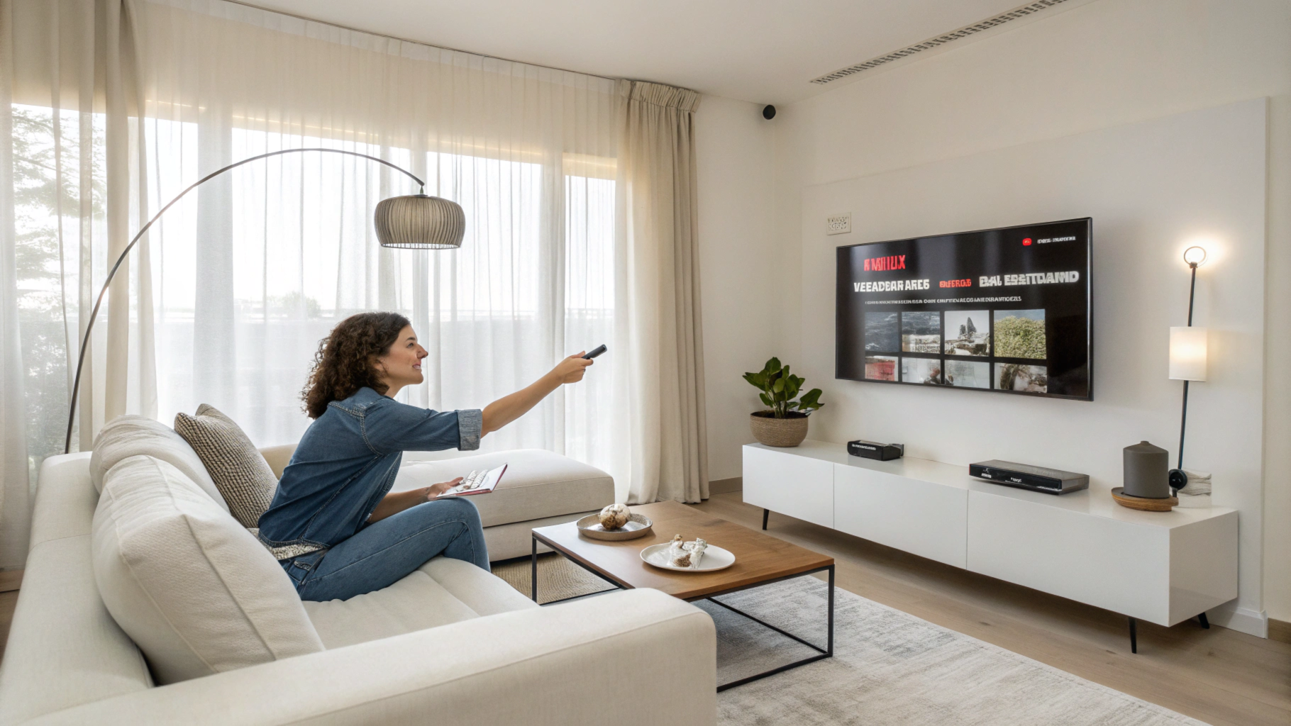
Prototypes for Smartphones
Since smartphones now surpass computers in user numbers, designing specific prototypes for these devices is crucial. A smartphone prototype simulates the functionality and interaction of a website on small screens, ensuring a comfortable and efficient user experience.
Considerations for Smartphone Prototypes:
- Interaction Design: Ensure the design is intuitive and easy to navigate on a touch screen.
- Usability Testing: Conduct tests to identify issues and optimize navigation and functionality.
Prototypes for Tablets
Designing for tablets requires consideration of differences compared to smartphones and computers. While the design may be similar to that of a mobile phone, tablets present unique challenges that must be addressed in the prototype.
Key Aspects for Tablet Prototypes:
- Touch Interaction: Ensure elements are easily accessible and functional on a larger screen than a smartphone.
- Adaptive Design: Consider usage variations and environments to optimize the experience.
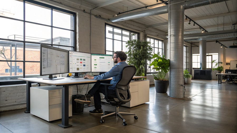
Prototypes for PCs
Although designing for PCs may seem simpler, the constant evolution of screens and devices requires meticulous prototyping. A PC prototype should reflect necessary changes and adaptations to provide a smooth and effective user experience.
Points to Consider for PC Prototypes:
- Responsive Design: Ensure the website adapts to different resolutions and screen sizes.
- Functionality Testing: Conduct thorough tests to ensure functionality across various usage environments.
Why choose Checkealos for your Web Development?
At Checkealos, we highly recommend using prototypes due to our extensive experience in user experience (UX). We believe that prototyping is an essential resource for ensuring successful web development from the start. Our team specializes in creating prototypes tailored to end users, ensuring optimal usability from the beginning of the project.
Contact us today for a free consultation and discover how we can help you improve your web design from the very first step.
Facing User Experience Challenges with Your Product? We can help you resolve them. Ideally, start working on user experience from the initial design phase, conducting testing and creating prototypes to ensure an efficient and satisfactory user experience.
I hope this article has been helpful. We’re here to help you optimize your users’ experience!