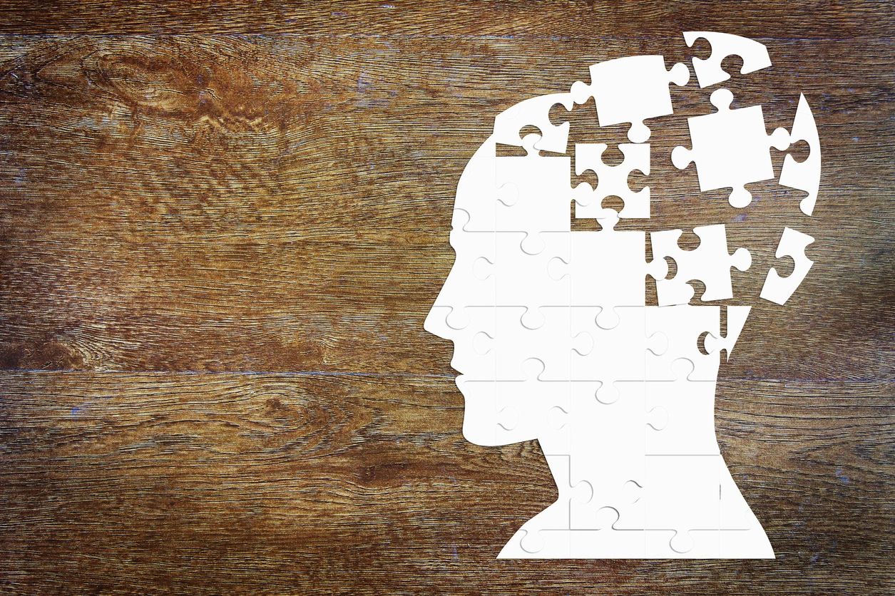
Understanding User Emotions: How Emotional Design Enhances UX
In the world of user experience (UX) design, emotions play an essential role. Users don’t just interact with interfaces functionally but also emotionally. Emotional design aims to connect with users’ feelings, creating more satisfying, memorable, and effective experiences. But how is this achieved in practice? In this post, we’ll explain how emotional design can improve UX, its benefits, and how to apply it effectively.
What is Emotional Design?
Emotional design focuses on creating interfaces that generate a positive emotional connection with the user. Beyond functionality and usability, it’s about designing with the intention of evoking emotions that enhance the perception of the interface. This type of design doesn’t just aim to help users complete tasks but also to enjoy the process and develop an affinity for the product or service.
Key Example: Think of products like the iPhone or apps like Spotify. They don’t just work well, they make users feel good while using them. That sense of pleasure, control, and satisfaction defines emotional design.
The importance of Emotional Design in UX
Emotional design adds a layer of value that goes beyond the practical. Users don’t just interact with an interface for its functionality but also for how it makes them feel. When products are designed to resonate emotionally, they tend to be more memorable, generate loyalty, and improve overall user satisfaction.
Benefits of Emotional Design:
- Increased user engagement: Positive emotions can boost interaction and retention.
- Market differentiation: An emotionally appealing design can make a product stand out from the competition.
- Customer loyalty: Users who experience positive emotions with a product are more likely to become loyal.
How to Apply Emotional Design in UX
1. Understand Your Audience
The first step is to deeply understand your users’ emotions, needs, and desires. Research tools like surveys and interviews can help you understand what emotions your users seek in an experience. Do they want to feel calm? Do they want to be surprised or motivated?
Tip: Create empathy maps to identify pain and pleasure points in the user’s interaction with your product.
2. Use Colors and Typography Strategically
Color is a powerful tool for evoking emotions. Warm tones can convey comfort, while cool colors can create a sense of calm or professionalism. Similarly, typography can influence how users perceive your brand’s personality.
Example: Meditation apps like Headspace use soft tones and friendly fonts to generate tranquility and trust.
3. Microinteractions
Small details, like subtle animations or immediate responses to user actions, can make an interface more emotionally engaging. These microinteractions not only improve functionality but also add an emotional layer.
Example: The “like” animations on social media platforms like Instagram provide a small burst of pleasure, making interactions more rewarding.
4. Storytelling
Telling a story through the interface is an effective way to emotionally engage users. Using a coherent narrative can guide the user through the experience while connecting with their emotions.
Example: Fitness apps that show users’ progress through visuals and motivational messages use emotional storytelling to keep users engaged.
Examples of Successful Emotional Design
Duolingo
Duolingo, the language-learning app, has successfully integrated emotional design through its playful and friendly approach. Animated characters, rewards, and positive reinforcement messages create an experience that motivates and gratifies users while they learn. This design makes the learning process not just more effective but also more enjoyable.
Mailchimp
Mailchimp, the popular email marketing tool, uses emotional design with its casual tone and friendly mascot. For example, Mailchimp’s error messages aren’t frustrating but are designed to calm and guide the user. This approach helps users feel supported even when something goes wrong.
Emotional design is a powerful tool in UX that not only enhances an interface’s functionality but also creates deeper and more satisfying connections with users. Understanding and applying these principles can be the key to differentiating your product and ensuring that users come back again and again.
Remember: Incorporate emotional elements subtly and progressively. Don’t overload your interface with too many stimuli, as it might backfire. Choose a key emotion you want to evoke and build your design around it.
Make your users not just use your product but love it.
Optimize your UX with Checkealos!
Ready to apply emotional design to your product? At Checkealos, we help you create interfaces that are not only functional but also connect with your users’ emotions.


