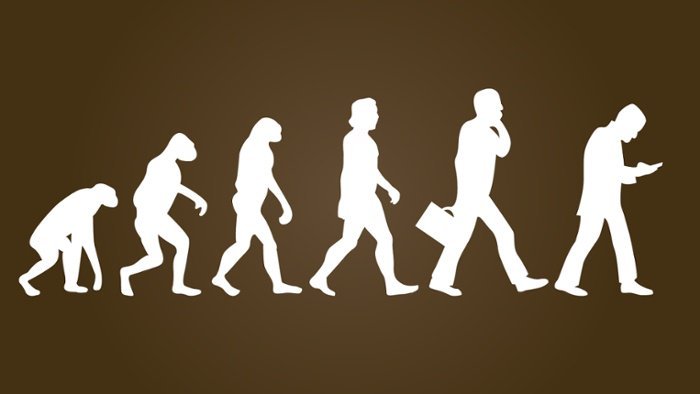
The evolution of UX: From functionality to User-Centered Design
In the early days of the World Wide Web, the primary concern of web developers was functionality. The goal was to create websites that worked correctly, with buttons and links that fulfilled their purpose. User experience (UX) was a concept that was almost nonexistent, relegated to the background by functionality.
The change with the arrival of the iPhone.
In 2007, Apple launched the first iPhone, a device that revolutionized the way we interact with technology. Steve Jobs and Apple’s designers understood the importance of an intuitive and attractive interface, with buttonless gesture control and clear visual cues. This approach marked a turning point in design, laying the foundation for the user-centered design that we know today.
What did Apple do differently?
The design of the iPhone’s user interface (UI): The iPhone interface was designed with a minimalist approach, using intuitive gestures to navigate the device. This made the iPhone easy to use for people of all ages and levels of technological experience.
App development in the early stages:
In the early years, companies rushed to launch apps without a strategic plan for user experience. These apps were basic and features were added to the original interface without coherent integration. Although the iPhone had driven the need for a more user-friendly experience, companies had not yet recognized the importance of user-centered design.
Google and material design.
Google introduced “Material Design,” a concept that sought a realistic design, but also a metaphor for reality. Apps and websites should not only be functional, but also relatable to users, aware of their own virtuality. Material Design focuses on meeting the needs and desires of users, taking into account the device on which the interface is being used.
- Google Maps: Google Maps uses Material Design to create an intuitive and visually appealing user experience. The interface is easy to navigate, with clear and concise information. Material Design Lite: Material Design Lite is a design framework that allows developers to create web and mobile applications with a modern and attractive design.
Designing for multiple devices.
Designers began to pay attention to adapting the interface to different devices. Elements such as navigation, scrolling, page layout, image sizes and menu styles were redesigned to ensure an optimal experience on each device.
What do we mean?
- Responsive websites: Responsive websites automatically adjust to the screen size of the device used to access them. This ensures an optimal user experience on smartphones, tablets and desktop computers.
- Responsive mobile applications: Responsive mobile applications are designed to adapt to different screen sizes. This allows applications to look and function correctly on a variety of devices.
The importance of user testing.
It became clear that the designers’ vision of a functional and well-designed product did not always coincide with users’ opinions. The lack of knowledge about the target audience led to the implementation of comprehensive user testing. User data and usability testing became crucial to identify design flaws in the early stages of the development process, reducing long-term production costs.
What do we mean?
- A/B testing: A/B testing allows designers to test different versions of an interface to determine which one works best.
- Usability testing: Usability testing involves real users interacting with a product or service and providing feedback on their experience.
The rise of UX.
The demand for UX professionals increased exponentially, solidifying the understanding that a brand or product was only as strong as the platform on which it was sold. With more data on users and their opinions, companies could offer better services and a more satisfying digital experience.
For example:
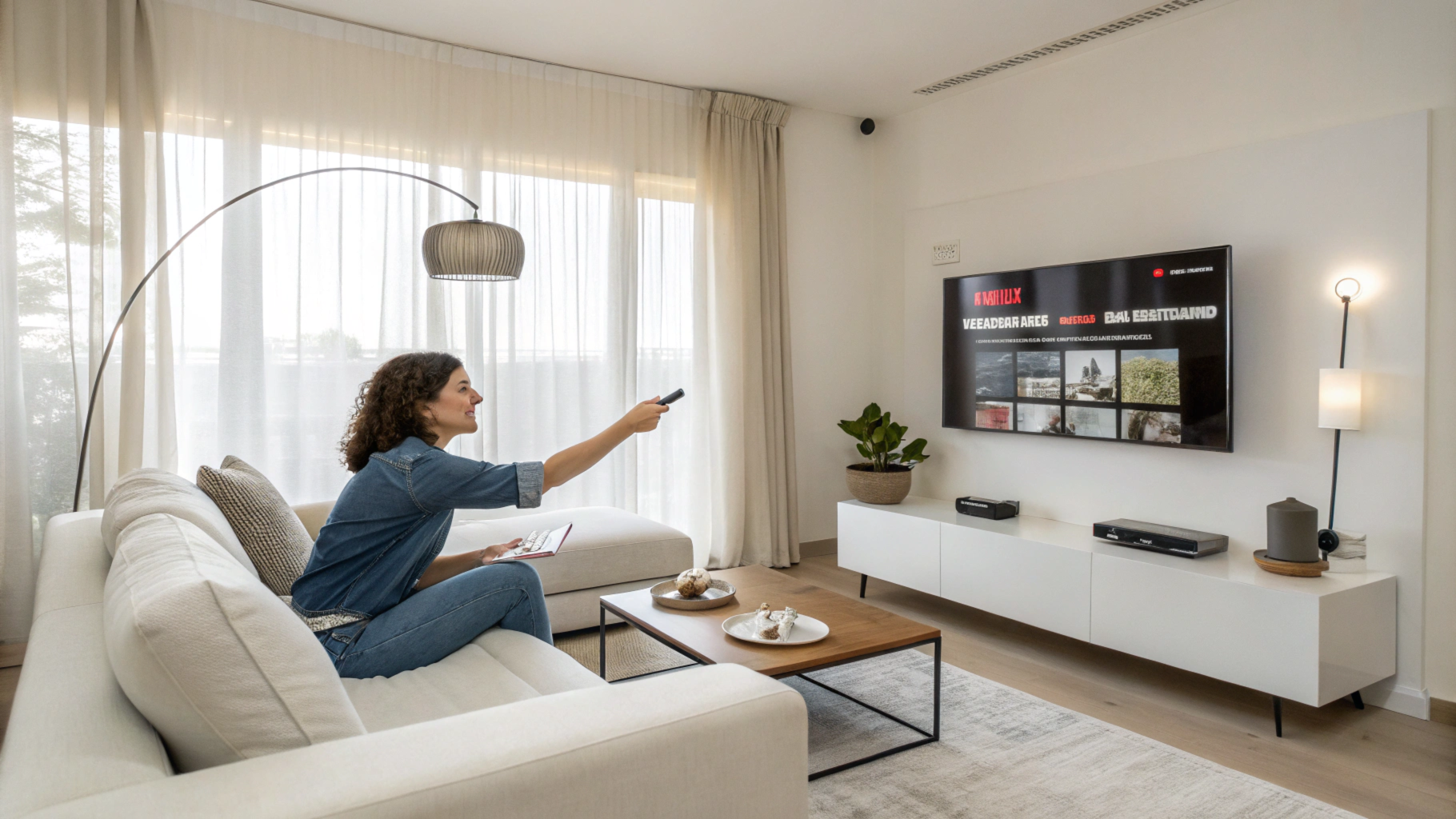
- Netflix: Netflix uses UX to provide a personalized experience for its users. The platform recommends movies and series based on each user’s preferences.
- Amazon: Amazon uses UX to facilitate the online purchase process. The platform offers a simple and intuitive shopping experience, with advanced search and filtering options.
The future of UX.
Today, UX is a fundamental factor in the success of any product. Many UX professionals are focusing on providing a “conversational experience,” using friendly chatbots for more direct communication with customers. The future of UX is based on a deep understanding of user needs, even when they themselves cannot articulate them.
What do we mean?
- Customer service chatbots: Chatbots are increasingly being used to provide fast and efficient customer service. Chatbots can answer frequently asked questions, resolve issues and provide personalized information.
- Virtual assistants: Virtual assistants like Siri, Alexa and Google Assistant are becoming increasingly popular. These assistants can perform tasks such as scheduling appointments, playing music and searching for information.
The evolution of UX has been a journey from basic functionality to the user-centered design that we know today. As technology advances, UX will continue to evolve to offer more intuitive, personalized and satisfying digital experiences.
Do you want to improve the user experience of your product or service? Checkealos helps you understand your customers better and create more engaging digital experiences. Contact us today for a free consultation!
Remember: UX is constantly evolving. Stay updated with the latest technologies, tools, and methodologies to deliver exceptional user experiences.
I hope this article has been helpful!


